Why we created this new welcome guide
At Enolisa we wanted to solve a very specific problem: when someone opens the app for the first time, it is not always obvious where to begin or how the value of the app builds over time.
The app has several important areas, but not all of them matter equally in minute one. That is why we launched a new welcome guide designed to support new users during their first steps without hiding the real navigation.
What this feature is meant to do
This guide was not created just to “explain menus.” Its purpose is to help a new user quickly understand:
- what they can do in Enolisa
- where it makes sense to start
- how saving wines, recording tastings, and viewing analytics connect with one another
- what they can expect from the app during the first sessions
In short, we wanted to reduce early confusion, accelerate the first moment of value, and make the entry into the experience feel more natural.
Why we did not want a classic fullscreen wizard
During design, we ruled out a more generic solution: a fullscreen carousel that would hide the entire app and move through slides like a tutorial.
It did not feel right for one simple reason: users could read polished messages without really understanding where anything was.
The current guide works differently. It sits on top of the real Enolisa interface while keeping visible:
- the bottom navigation
- the subtabs when we are inside Cellar
- the visual context of the screen being explained
That means the experience teaches not only concepts, but also location.
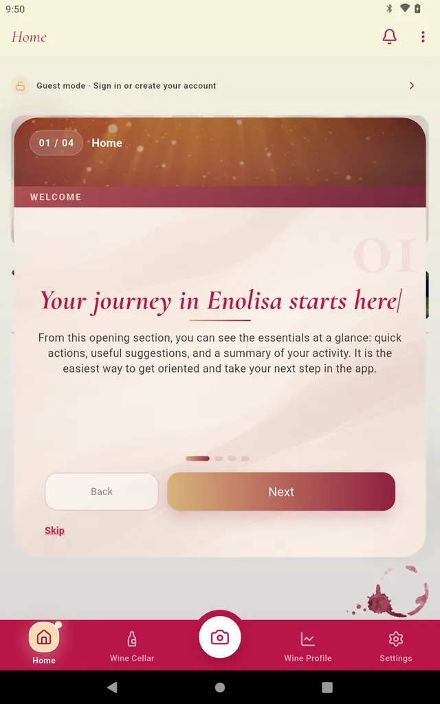
This screenshot captures that idea well. It is not an isolated slide outside the product: it is the guide sitting on top of the real Enolisa interface so users can understand explanation and location at the same time.

What we want to show on each screen
This first version of the wizard focuses on the most important screens for a first session. We did not want to include everything. We prioritized what helps a person start with real meaning.
1. Home
The first screen explains that Home is where you can quickly see what matters most:
- quick actions
- useful suggestions
- reminders
- a summary of your activity
The idea is to show that Home is not just a landing screen. It is the easiest place to orient yourself and decide what to do next.
2. Cellar > My wines
Here we show the practical core of the app. My wines is the foundation of the journal:
- where you start building your personal collection
- where you return to a saved bottle when you need it
- where much of Enolisa’s future value begins
We wanted users to understand that saving a first wine is not an isolated action, but the start of a longer experience.
3. Cellar > Tastings
The third screen focuses on tastings because this is where the app becomes much richer.
Recording a tasting allows you to:
- save your own sensations and notes
- add real context to each wine
- start building more accurate preferences
Enolisa is useful without tastings. With tastings, it becomes much more personal.
4. My Experience
The fourth screen explains the medium-term value promise: My Experience is the area where the app turns usage into perspective.
This is where users can gradually find:
- evolution over time
- grapes, countries, and regions
- cellar value
- palate profile
- reports and insights built from wines and tastings
It was important to explain this honestly: this is not a section that is “full” from the first minute, but one that grows as you use Enolisa.
How the guide works in practice
The guide does more than place text on top of the app. It is designed to accompany real navigation and turn each step into a useful explanation in context.
During the flow:
- users continue to see the real Enolisa interface
- the main navigation stays visible so orientation is never lost
- when we move into
Cellar, the relevant subtabs also remain visible - the active section is visually highlighted so it is clear where each explanation is happening
This matters because users are not just receiving a general promise about the app. They are also learning, in context, where they will find each area when they come back later on their own.
The guide also tries to connect each screen with a clear intention:
- in
Home, helping users understand the overall map of the app - in
My wines, inviting them to begin building their personal cellar - in
Tastings, explaining how a richer and more personal journal starts to take shape - in
My Experience, showing the value that grows progressively with usage
Navigation stays intentionally simple:
- move to the next step
- go back to the previous one
- skip the guide at any moment
But the main value is not in the buttons. It is in the fact that the experience accompanies users while they visually recognize the real app, the exact section they are in, and the role that screen plays in the wider Enolisa journey.
What we expect this to improve
With this change, we expect new users to:
- understand the structure of Enolisa more quickly
- find their first useful step faster
- understand sooner how cellar, tastings, and analytics connect
- feel a clearer, warmer, and less abstract welcome
We also expect the first minutes in the app to feel more approachable, especially for people arriving without yet knowing the full product flow.
A guide designed to support, not to impose
The new Enolisa welcome guide is not meant to be an intrusive tutorial. It is meant to be a first orientation with real context.
That is why we chose a shorter guide, visible on top of the app and focused on the areas that matter most at the beginning. It is a way to support users with more clarity and one simple idea behind it: understanding the app better from the start makes it much easier to enjoy later.